
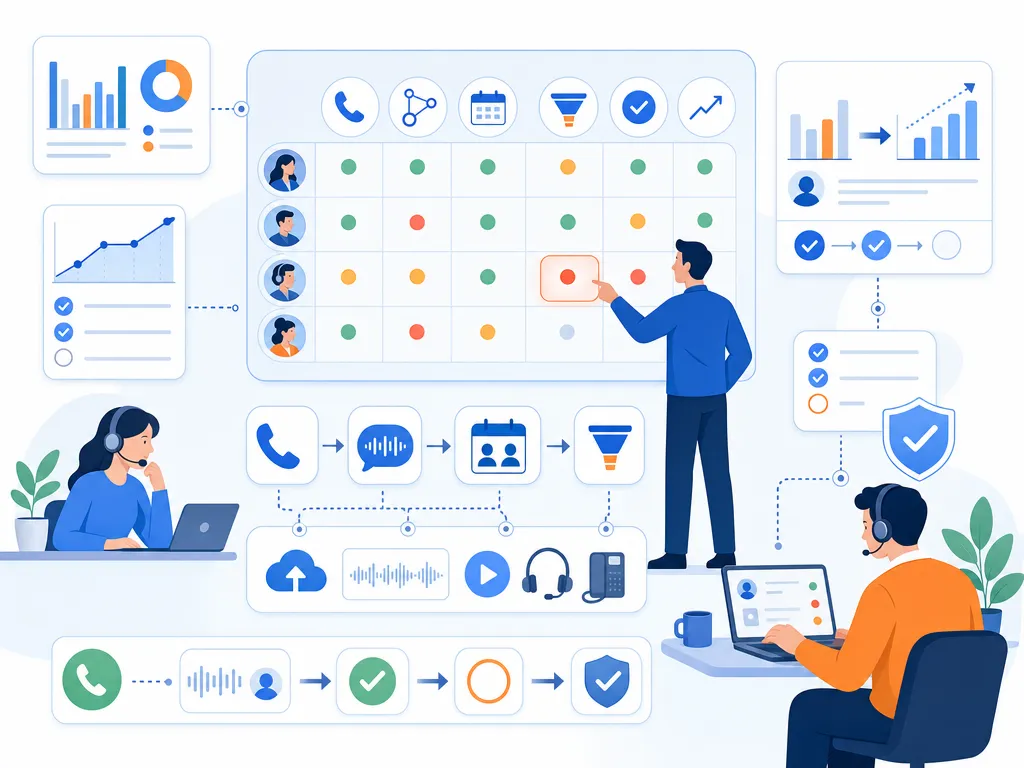
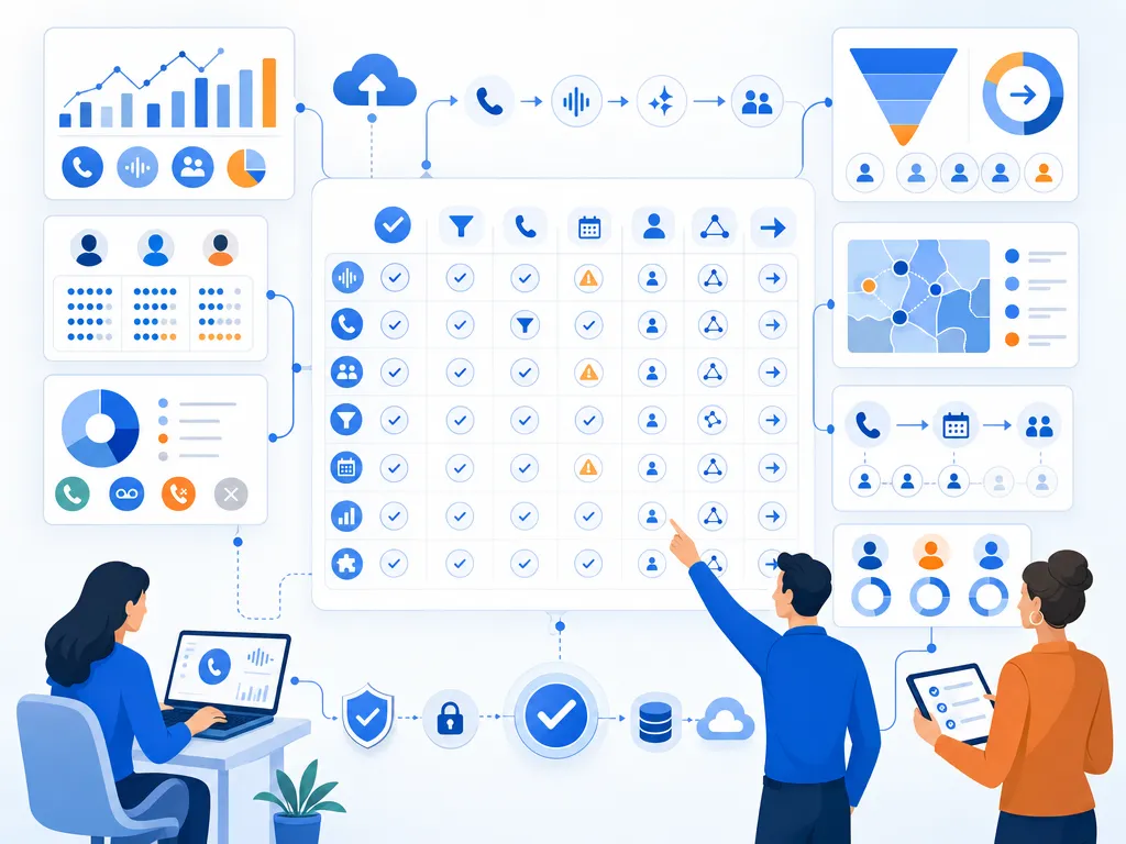
TL;DR: Sales call analytics dashboards are sales reporting views for outbound and inbound call motions that connect activity, outcomes, coaching, and pipeline impact across SDRs, BDRs, AEs, RevOps, managers, VPs of Sales, CROs, founders, and executives, using KPI cards, trend lines, heat maps, funnels, ranked lists, scorecards, goal progress bars, stacked outcome charts, overdue task lists, and filters such as date range, rep, team, region, territory, campaign, lead source, persona, CRM stage, deal size, tenure, ramp status, and revenue owner. The article gives 10 dashboard examples including sales rep activity with calls made, connected calls, missed calls, voicemails, average call duration, meetings booked, and follow-up tasks, sales team performance with connection rate, average talk time, opportunities created, and connected-call-to-meeting conversion, call connection rate with calls placed, answered and unanswered calls, time-of-day, day-of-week, and attempts per lead, outreach productivity with calls, emails, social or text touches, overdue tasks, touchpoints per opportunity, and cadence completion, call outcome tracking for dispositions such as no answer, voicemail, wrong number, not interested, follow-up requested, meeting booked, and disqualified, coaching dashboards for openers, discovery, objections, qualification, next steps, talk time, call length, meeting conversion, and ramp progress, pipeline impact dashboards for calls to meetings, meetings to opportunities, stage progression, pipeline value influenced by calls, and closed-won revenue, leader dashboards for total calls, connection rate, meetings, opportunities, pipeline, quota, and forecast context, SDR and BDR leaderboards that balance calls made, connected calls, meetings booked, show rate, qualified opportunities, and conversion rate, and follow-up and SLA dashboards tracking tasks created, completed, overdue, time to follow-up, calls needing next action, and meetings scheduled after follow-up. Core KPI groups are activity metrics such as calls made, attempts per lead, first and last call time, and completed follow-ups, engagement metrics such as connected calls, connection rate, average duration, and talk time, outcome metrics such as dispositions, meetings booked, conversion rate, and disqualification rate, and revenue metrics such as opportunities created, pipeline value, stage progression, and closed-won revenue, with guidance to diagnose high volume plus low connection as list or timing issues, high connection plus low meetings as messaging or discovery issues, long calls plus low conversion as weak qualification, short connected calls plus high rejection as poor audience fit or openers, strong activity plus weak pipeline as account targeting problems, and good meetings plus poor opportunity creation as handoff, show-rate, or qualification gaps.
Sales teams make thousands of calls, but call volume alone rarely tells the full story. A strong sales call analytics dashboard helps managers see which activities create conversations, which conversations create opportunities, and where reps need coaching.
Below are practical sales call analytics dashboard examples you can adapt for SDR teams, account executives, RevOps, and sales leaders. Each example includes the metrics to track, suggested visuals, and how to interpret what the dashboard is telling you.
What is a sales call analytics dashboard
A sales call analytics dashboard is a reporting view that visualizes sales calling activity, call outcomes, rep performance, and related pipeline impact. It is more specific than a general sales dashboard because it focuses on call-based selling motions: outbound calls, inbound sales conversations, connection rates, talk time, call outcomes, meetings booked, follow-up activity, and opportunities influenced by calls.

It is also different from a support call center dashboard. Support dashboards often prioritize service levels, queue times, and customer satisfaction. Sales call dashboards prioritize outreach productivity, conversation quality, conversion rates, pipeline creation, and coaching opportunities.
Sales call analytics dashboard examples
Sales rep activity dashboard
This dashboard gives individual reps a clear view of their daily and weekly calling performance. It should be simple enough for reps to check quickly and specific enough to show whether activity is translating into meaningful sales conversations.

- Best for: SDRs, BDRs, account executives, and frontline sales reps.
- Core KPIs: calls made, connected calls, missed calls, voicemails left, average call duration, meetings booked, follow-up tasks completed.
- Suggested visuals: KPI cards for daily totals, a trend line for calls over time, and a call outcome breakdown by disposition.
- Useful filters: date range, call direction, lead source, campaign, and call outcome.
How to read it: If a rep has high call volume but few connected calls, the issue may be list quality, timing, territory coverage, or messaging. If connected calls are strong but meetings booked are low, review the call approach, qualification questions, and next-step process.
Sales team performance dashboard
A manager dashboard compares rep performance across the team and helps identify where coaching or process changes are needed. It should show both activity volume and outcome quality so managers do not reward activity that fails to produce pipeline.
- Best for: SDR managers, BDR managers, inside sales managers, and revenue team leads.
- Core KPIs: total calls, connected calls, connection rate, average talk time, meetings booked, opportunities created, conversion rate from connected call to meeting.
- Suggested visuals: rep comparison list, team trend charts, goal progress bars, and call outcome distribution.
- Useful filters: rep, team, region, territory, date range, call type, and campaign.
How to read it: Look for outliers. A rep with low call volume but high conversion may have a strong talk track that can be shared with the team. A rep with high volume and low outcomes may need help with targeting, timing, or discovery.
Call connection rate dashboard
Connection rate is one of the most important sales call KPIs because it shows how often outreach turns into live conversations. This dashboard isolates the factors that influence whether prospects actually answer.
- Best for: prospecting teams, RevOps, and managers optimizing outbound sequences.
- Core KPIs: calls placed, answered calls, unanswered calls, connection rate, time-of-day performance, day-of-week performance, call attempts per lead.
- Suggested visuals: heat map by hour and weekday, trend line for connection rate, and breakdown by lead source or segment.
- Useful filters: time zone, region, persona, list source, campaign, and rep.
How to read it: If connection rates vary sharply by time of day or lead source, adjust call blocks and prioritization. If connection rate drops across the entire team, investigate data freshness, caller reputation, list quality, or changes in audience behavior.
Sales outreach productivity dashboard
Sales calls rarely happen in isolation. This dashboard combines call activity with other outreach actions, such as emails, text messages, social touches, or follow-up tasks, depending on what your team tracks.
- Best for: teams running multi-touch outbound cadences.
- Core KPIs: calls made, emails sent, follow-ups completed, tasks overdue, contacts touched, touchpoints per opportunity, meetings booked.
- Suggested visuals: activity mix chart, cadence completion trend, rep productivity comparison, and task completion list.
- Useful filters: campaign, sequence, rep, account tier, lead status, and CRM stage.
How to read it: If reps are calling but not completing follow-up tasks, opportunities may stall after the first conversation. If activity is high across channels but meetings are low, review targeting and messaging rather than simply increasing volume.
Call outcome dashboard
A call outcome dashboard shows what happened after each call. Instead of only counting calls, it groups conversations by result: connected, no answer, voicemail, wrong number, not interested, follow-up requested, meeting booked, or other dispositions your team uses.
- Best for: sales teams that want cleaner forecasting, better coaching, and more reliable CRM data.
- Core KPIs: call disposition counts, outcome rate by rep, outcome rate by lead source, meetings booked, follow-up requested, disqualified prospects.
- Suggested visuals: stacked bar chart by outcome, disposition trend over time, and rep-level outcome comparison.
- Useful filters: disposition, campaign, lead source, rep, call direction, and CRM stage.
How to read it: If too many calls are categorized as generic or unknown, managers lose visibility into what is really happening. If one lead source produces a high share of wrong numbers or disqualified prospects, it may need cleanup or lower prioritization.
Sales call coaching dashboard
A coaching dashboard helps managers decide where to spend one-on-one time. It should highlight patterns that suggest a rep needs help with opening, discovery, objection handling, qualification, or next-step setting.
- Best for: sales managers, enablement teams, and new-hire ramp programs.
- Core KPIs: connected calls, talk time, average call duration, meeting conversion rate, follow-up completion, call outcomes, ramp progress by rep.
- Suggested visuals: rep scorecard, trend line by coaching period, call outcome comparison, and a list of calls to review based on selected criteria.
- Useful filters: tenure, manager, rep, outcome, call length, campaign, and deal stage.
How to read it: Long calls with low conversion may indicate weak qualification or unclear next steps. Very short connected calls may point to poor openers, list mismatch, or fast objections. Use the dashboard to choose which calls and situations deserve deeper review.
Sales pipeline impact dashboard
This dashboard connects call activity to pipeline movement. It helps answer a critical question: are sales calls creating measurable business outcomes?
- Best for: RevOps, sales leaders, and managers responsible for pipeline creation.
- Core KPIs: calls to meetings, meetings to opportunities, opportunities created, pipeline value influenced by calls, stage progression after calls, closed-won revenue associated with call activity.
- Suggested visuals: funnel from call to opportunity, pipeline trend by call source, and opportunity movement by call activity.
- Useful filters: opportunity stage, lead source, campaign, rep, account segment, deal size, and date range.
How to read it: If call activity is increasing but pipeline is flat, the team may be reaching the wrong accounts, using weak qualification criteria, or failing to convert conversations into next steps. If fewer calls are producing more pipeline, identify the segments, scripts, or reps driving higher-quality conversations.
Sales leader dashboard
An executive sales call dashboard should focus on trends and outcomes rather than every activity detail. The goal is to show whether call-based selling is supporting revenue goals.
- Best for: VPs of Sales, CROs, founders, and executive stakeholders.
- Core KPIs: total sales calls, connection rate, meetings booked, opportunities created, pipeline created, quota progress, forecast context.
- Suggested visuals: executive KPI cards, monthly trend lines, pipeline contribution chart, and team performance summary.
- Useful filters: business unit, team, region, segment, month, quarter, and revenue owner.
How to read it: Executives should look for directional trends. If meetings are rising but opportunities are not, qualification may be too loose. If pipeline is growing but close rates are not, the team may need better discovery, handoff, or deal management.
SDR and BDR sales leaderboard dashboard
A leaderboard can motivate sales development teams when it balances activity and outcomes. Avoid ranking reps only by raw call count, because that can encourage low-quality activity.
- Best for: SDR and BDR teams with clear activity and meeting goals.
- Core KPIs: calls made, connected calls, meetings booked, meeting show rate, qualified opportunities, conversion rate.
- Suggested visuals: ranked list, goal progress indicators, weekly trend, and badges for top outcome metrics.
- Useful filters: week, month, team, territory, role, and ramp status.
How to read it: A useful leaderboard rewards both effort and effectiveness. Consider showing call volume next to connected-call conversion and meetings booked so reps see what high-quality performance looks like.
Sales follow-up and SLA dashboard
Many sales opportunities are lost after the call because follow-up is late, incomplete, or inconsistent. A follow-up dashboard shows whether reps are taking the next actions promised during conversations.
- Best for: inbound sales teams, account executives, SDR teams, and managers tracking response discipline.
- Core KPIs: follow-up tasks created, follow-up tasks completed, overdue tasks, time to follow-up, calls requiring next action, meetings scheduled after follow-up.
- Suggested visuals: overdue task list, time-to-follow-up trend, rep completion comparison, and calls without next steps.
- Useful filters: rep, lead source, priority, CRM stage, call outcome, and date range.
How to read it: If calls are producing interest but follow-up is slow, managers should tighten expectations around next steps. If follow-up is fast but conversion is low, review message quality and whether the call created a compelling reason to continue.
Best sales call dashboard KPIs
The right KPIs depend on your sales motion, but most call analytics dashboards should include a mix of activity, engagement, quality, outcome, and revenue-impact metrics.

Sales activity metrics
- Calls made: total outbound or inbound sales calls logged during a period.
- Call attempts per lead: how many times reps try to reach a prospect.
- First and last call time: useful for understanding work patterns and coverage.
- Follow-up tasks completed: whether reps are taking the next action after calls.
Call engagement metrics
- Connected calls: calls where a rep reaches a live prospect or customer.
- Connection rate: connected calls divided by total attempted calls.
- Average call duration: the average length of completed calls.
- Talk time: the amount of time spent in live conversations.
Sales outcome metrics
- Call dispositions: categorized outcomes such as no answer, voicemail, interested, meeting booked, or not a fit.
- Meetings booked: calls that result in a scheduled meeting or demo.
- Conversion rate: the percentage of connected calls that produce the desired next step.
- Disqualification rate: the percentage of calls that remove poor-fit prospects from the pipeline.
Sales revenue impact metrics
- Opportunities created: qualified opportunities that originate from or are influenced by calls.
- Pipeline value: potential revenue connected to opportunities where call activity played a role.
- Stage progression: whether opportunities move forward after meaningful sales conversations.
- Closed-won revenue: revenue associated with accounts or opportunities that included sales call activity.
How to read a sales call dashboard
A dashboard is only useful if it leads to decisions. Here are common patterns sales managers should watch for.

- High call volume and low connection rate: review list quality, call timing, phone number data, segmentation, and outreach strategy.
- High connection rate and low meeting rate: coach reps on opening statements, discovery questions, value proposition, and next-step language.
- Long talk time and low conversion: calls may be friendly but unfocused. Review qualification and close for next step.
- Short connected calls and high rejection: reps may be reaching the wrong audience or losing prospects in the first few seconds.
- Strong activity and weak pipeline: evaluate whether the team is prioritizing the right accounts and whether CRM stages reflect real buying intent.
- Good meetings booked and poor opportunity creation: check handoff quality, meeting show rates, and qualification criteria.
A strong sales call dashboard should not just answer “How many calls did we make?” It should answer “Which calls are creating conversations, next steps, and pipeline?”
What to show first on your sales dashboard
The top of a sales call dashboard should help users understand performance in seconds. Keep the most important metrics visible before deeper drilldowns.

- Top KPI cards: calls made, connected calls, connection rate, meetings booked, opportunities created.
- Trend chart: daily or weekly performance for calls, connections, and meetings.
- Rep comparison: a ranked or grouped view of reps by activity and outcomes.
- Outcome breakdown: call dispositions by count and percentage.
- Pipeline context: opportunities or pipeline influenced by call activity.
Below the fold, add detail views for call logs, segments, campaigns, coaching notes, and follow-up tasks.
Sales call dashboard filters to add
Filters make dashboards more useful because they let managers isolate what is working and where performance is breaking down.

- Rep or team
- Date range
- Call direction
- Lead source
- Campaign or sequence
- CRM stage
- Call outcome or disposition
- Region, territory, or time zone
- Account segment or deal size
- New hire versus ramped rep
How managers use call analytics for coaching
Call analytics dashboards are especially valuable when they turn performance data into coaching conversations. Instead of relying only on gut feel, managers can use patterns in the data to decide where each rep needs help.
- Identify outliers: compare reps with similar territories or lead sources to find coaching opportunities.
- Review conversion gaps: focus on the step where each rep loses momentum, such as connection to meeting or meeting to opportunity.
- Spot follow-up issues: look for calls with positive outcomes but missing next actions.
- Share best practices: study reps who convert efficiently and turn their approach into team training.
- Track coaching impact: compare performance before and after coaching sessions to see whether behavior changes.
Common sales call dashboard mistakes

- Tracking only call volume: activity matters, but outcomes matter more.
- Adding too many KPIs: crowded dashboards are harder to use and easier to ignore.
- Ignoring call outcomes: without dispositions, managers cannot tell whether calls are productive.
- Mixing unrelated teams: inbound sales, outbound SDRs, and account executives often need different benchmarks.
- Using stale data: dashboards lose trust when they do not reflect recent activity.
- Skipping CRM context: call analytics should connect to pipeline, opportunities, and revenue goals where possible.
- Building dashboards no one owns: assign responsibility for definitions, cleanup, and review cadence.
Sales call analytics dashboard checklist
Before publishing or rolling out a dashboard, confirm that it answers the questions your team actually needs to answer.
- Does the dashboard separate activity metrics from outcome metrics?
- Can managers compare reps fairly by team, role, segment, or territory?
- Are call outcomes or dispositions consistently defined?
- Can users filter by date range, rep, lead source, campaign, and CRM stage?
- Does the dashboard show conversion from calls to meetings or opportunities?
- Is there a clear review cadence for reps, managers, and leaders?
- Does each metric have an owner and an agreed definition?
Sales call dashboard FAQ
What should a sales call dashboard include
A sales call analytics dashboard should include call activity, connected calls, connection rate, average call duration, call outcomes, meetings booked, follow-up completion, opportunities created, and pipeline context. The exact metrics should match your sales motion and goals.

How is a sales dashboard different from call analytics
A sales dashboard usually covers broad revenue and pipeline metrics such as quota attainment, forecast, win rate, and pipeline value. A call analytics dashboard focuses specifically on sales calls, including call attempts, conversations, outcomes, rep performance, and call-driven pipeline impact.
Which call metrics matter most for sales managers
Sales managers should pay close attention to connected calls, connection rate, meetings booked, conversion from connected call to meeting, call outcomes, follow-up completion, and opportunities created. These metrics show both effort and effectiveness.
How often should sales teams review call dashboards
Reps may review personal call metrics daily, managers may review team dashboards daily or weekly, and executives may review higher-level call and pipeline trends weekly or monthly. The right cadence depends on call volume, sales cycle length, and team goals.
How do call dashboards improve sales coaching
They help managers identify where reps need support. For example, low connection rates may point to timing or list issues, while high connection rates with low meeting conversion may point to messaging, discovery, or next-step challenges.
Final sales call dashboard takeaway
The best sales call analytics dashboards do more than count dials. They connect calling activity to conversations, outcomes, follow-up, and pipeline. Start with a focused dashboard for reps and managers, then add executive and RevOps views as your reporting process matures.

If you are reviewing your sales calling workflow, use the examples above to decide which metrics your team needs, how those metrics should be filtered, and how managers will turn the data into coaching action.
Ready to close more deals with Kixie?
See how Kixie's AI-powered tools can transform your sales and support operations.
Start Free Trial